Up YourGAME
Designed for AMBITION.
Built for GLOBAL MASTERY.
Applied Experiential Learning
Profile Building
Admissions to Singapore's Top Public Universities
Your Journey to Singapore's Top Universities
A structured pathway from exploration to admission
Experience world-class university campuses and culture
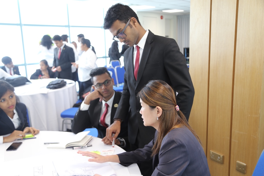
Internship
Hands-on academic internships with industry exposure
Publish research with university faculty mentors
Full semester study at Singapore's top universities
Pathway to undergraduate & postgraduate admissions
Immersion
GCIP, GCAP & GUIDEExperience world-class university campuses and culture
Academic Internship
GAIP & AIYAHands-on academic internships with industry exposure
Research
GRIP & FIREPublish research with university faculty mentors
Semester in Singapore
VSPFull semester study at Singapore's top universities
Admission
U/G & P/GPathway to undergraduate & postgraduate admissions
*Admission to each university is determined by its own eligibility criteria and established admission process.
1st July, 2026
Admissions open on 1st July for all programmes. Claim 'Early Action' fee.
5th February, 2026
With eye on growth, Corporate Gurukul doubles team size with new hires joining India office
31st January, 2026
Inaugural Global Certificate Immersion Programme (GCIP) delivered with SUSS for 7 universities and 137 participants from India
3rd January, 2026
Admissions open for Summer Programmes
15th August, 2025
Boston Consulting Group (BCG), Singapore starts strategic mentoring for Corporate Gurukul, for amplifying experiential learning and growth
15th July, 2025
Launch of India's first in-person AI Bootcamp with AWS for high school students in Kunskapsskolan International School, India
Our Global IMPACT
Empowering students worldwide with transformative learning experiences
of our academic internship and research participants progress to QS Top 50 universities — powered by comprehensive programmes and unmatched guidance.
Experiential Learning with
Top Universities and Corporates
Deep academic-industry integration with world-class universities and global industry leaders—placing students in real-world research labs and innovation hubs for hands-on, outcome-driven learning.
Experiential Learning with Universities
Experiential Learning with Corporates
'%20id='g1865'%3e%3cpath%20id='path1857'%20d='M86.4%2066.4c0%203.7.4%206.7%201.1%208.9.8%202.2%201.8%204.6%203.2%207.2.5.8.7%201.6.7%202.3%200%201-.6%202-1.9%203L83.2%2092c-.9.6-1.8.9-2.6.9-1%200-2-.5-3-1.4-1.4-1.5-2.6-3.1-3.6-4.7-1-1.7-2-3.6-3.1-5.9-7.8%209.2-17.6%2013.8-29.4%2013.8-8.4%200-15.1-2.4-20-7.2-4.9-4.8-7.4-11.2-7.4-19.2%200-8.5%203-15.4%209.1-20.6%206.1-5.2%2014.2-7.8%2024.5-7.8%203.4%200%206.9.3%2010.6.8%203.7.5%207.5%201.3%2011.5%202.2v-7.3c0-7.6-1.6-12.9-4.7-16-3.2-3.1-8.6-4.6-16.3-4.6-3.5%200-7.1.4-10.8%201.3-3.7.9-7.3%202-10.8%203.4-1.6.7-2.8%201.1-3.5%201.3-.7.2-1.2.3-1.6.3-1.4%200-2.1-1-2.1-3.1v-4.9c0-1.6.2-2.8.7-3.5.5-.7%201.4-1.4%202.8-2.1%203.5-1.8%207.7-3.3%2012.6-4.5C41%201.9%2046.2%201.3%2051.7%201.3c11.9%200%2020.6%202.7%2026.2%208.1%205.5%205.4%208.3%2013.6%208.3%2024.6v32.4zM45.8%2081.6c3.3%200%206.7-.6%2010.3-1.8%203.6-1.2%206.8-3.4%209.5-6.4%201.6-1.9%202.8-4%203.4-6.4.6-2.4%201-5.3%201-8.7v-4.2c-2.9-.7-6-1.3-9.2-1.7-3.2-.4-6.3-.6-9.4-.6-6.7%200-11.6%201.3-14.9%204-3.3%202.7-4.9%206.5-4.9%2011.5%200%204.7%201.2%208.2%203.7%2010.6%202.4%202.5%205.9%203.7%2010.5%203.7zm80.3%2010.8c-1.8%200-3-.3-3.8-1-.8-.6-1.5-2-2.1-3.9L96.7%2010.2c-.6-2-.9-3.3-.9-4%200-1.6.8-2.5%202.4-2.5h9.8c1.9%200%203.2.3%203.9%201%20.8.6%201.4%202%202%203.9l16.8%2066.2%2015.6-66.2c.5-2%201.1-3.3%201.9-3.9.8-.6%202.2-1%204-1h8c1.9%200%203.2.3%204%201%20.8.6%201.5%202%201.9%203.9l15.8%2067%2017.3-67c.6-2%201.3-3.3%202-3.9.8-.6%202.1-1%203.9-1h9.3c1.6%200%202.5.8%202.5%202.5%200%20.5-.1%201-.2%201.6-.1.6-.3%201.4-.7%202.5l-24.1%2077.3c-.6%202-1.3%203.3-2.1%203.9-.8.6-2.1%201-3.8%201h-8.6c-1.9%200-3.2-.3-4-1-.8-.7-1.5-2-1.9-4L156%2023l-15.4%2064.4c-.5%202-1.1%203.3-1.9%204-.8.7-2.2%201-4%201zm128.5%202.7c-5.2%200-10.4-.6-15.4-1.8-5-1.2-8.9-2.5-11.5-4-1.6-.9-2.7-1.9-3.1-2.8-.4-.9-.6-1.9-.6-2.8v-5.1c0-2.1.8-3.1%202.3-3.1.6%200%201.2.1%201.8.3.6.2%201.5.6%202.5%201%203.4%201.5%207.1%202.7%2011%203.5%204%20.8%207.9%201.2%2011.9%201.2%206.3%200%2011.2-1.1%2014.6-3.3%203.4-2.2%205.2-5.4%205.2-9.5%200-2.8-.9-5.1-2.7-7-1.8-1.9-5.2-3.6-10.1-5.2L246%2052c-7.3-2.3-12.7-5.7-16-10.2-3.3-4.4-5-9.3-5-14.5%200-4.2.9-7.9%202.7-11.1%201.8-3.2%204.2-6%207.2-8.2%203-2.3%206.4-4%2010.4-5.2%204-1.2%208.2-1.7%2012.6-1.7%202.2%200%204.5.1%206.7.4%202.3.3%204.4.7%206.5%201.1%202%20.5%203.9%201%205.7%201.6%201.8.6%203.2%201.2%204.2%201.8%201.4.8%202.4%201.6%203%202.5.6.8.9%201.9.9%203.3v4.7c0%202.1-.8%203.2-2.3%203.2-.8%200-2.1-.4-3.8-1.2-5.7-2.6-12.1-3.9-19.2-3.9-5.7%200-10.2.9-13.3%202.8-3.1%201.9-4.7%204.8-4.7%208.9%200%202.8%201%205.2%203%207.1%202%201.9%205.7%203.8%2011%205.5l14.2%204.5c7.2%202.3%2012.4%205.5%2015.5%209.6%203.1%204.1%204.6%208.8%204.6%2014%200%204.3-.9%208.2-2.6%2011.6-1.8%203.4-4.2%206.4-7.3%208.8-3.1%202.5-6.8%204.3-11.1%205.6-4.5%201.4-9.2%202.1-14.3%202.1z'%20fill='%23252f3e'/%3e%3cg%20id='g1863'%3e%3cpath%20id='path1859'%20d='M273.5%20143.7c-32.9%2024.3-80.7%2037.2-121.8%2037.2-57.6%200-109.5-21.3-148.7-56.7-3.1-2.8-.3-6.6%203.4-4.4%2042.4%2024.6%2094.7%2039.5%20148.8%2039.5%2036.5%200%2076.6-7.6%20113.5-23.2%205.5-2.5%2010.2%203.6%204.8%207.6z'%20class='st1'/%3e%3cpath%20id='path1861'%20d='M287.2%20128.1c-4.2-5.4-27.8-2.6-38.5-1.3-3.2.4-3.7-2.4-.8-4.5%2018.8-13.2%2049.7-9.4%2053.3-5%203.6%204.5-1%2035.4-18.6%2050.2-2.7%202.3-5.3%201.1-4.1-1.9%204-9.9%2012.9-32.2%208.7-37.5z'%20class='st1'/%3e%3c/g%3e%3c/g%3e%3c/svg%3e)
Why Choose Us
Six pillars that make Corporate Gurukul the preferred choice for transformative learning experiences
Academic Excellence
Learn with world-class universities including NUS, SMU, SUTD and SUSS for cutting-edge curriculum and expert faculty guidance.
Experiential Learning
Hands-on projects, real-world case studies, and immersive experiences that transform theoretical knowledge into practical skills.
Industry Integration
Direct exposure to industry leaders, corporate partnerships, and real-world business scenarios that bridge academia and professional life.
Proven Track Record
18+ years of excellence with 170,000+ alumni network and 95% admission success rate to top global universities.
Global Perspective
International exposure in Singapore, cross-cultural learning, and global networking opportunities spanning 40+ countries.
Innovation Focus
Emphasis on emerging technologies, entrepreneurship, design thinking, and future-ready skills for tomorrow's leaders.
Join 170,000+ alumni who chose excellence
Explore Our Programmes
Transformative learning experiences designed to bridge the gap between academia and industry.
Our Alumni Network
Join us and explore how our 170,000+ alumni across continents are inspiring millions and transforming lives by following their purpose and passion.
GEMS Modern Academy
Dubai, UAE

DPS Sharjah
Sharjah, UAE

Canadian International School
Singapore

Heritage International Xperiential School
India
Global Indian International School
Singapore
The International School Bangalore
Bengaluru, India
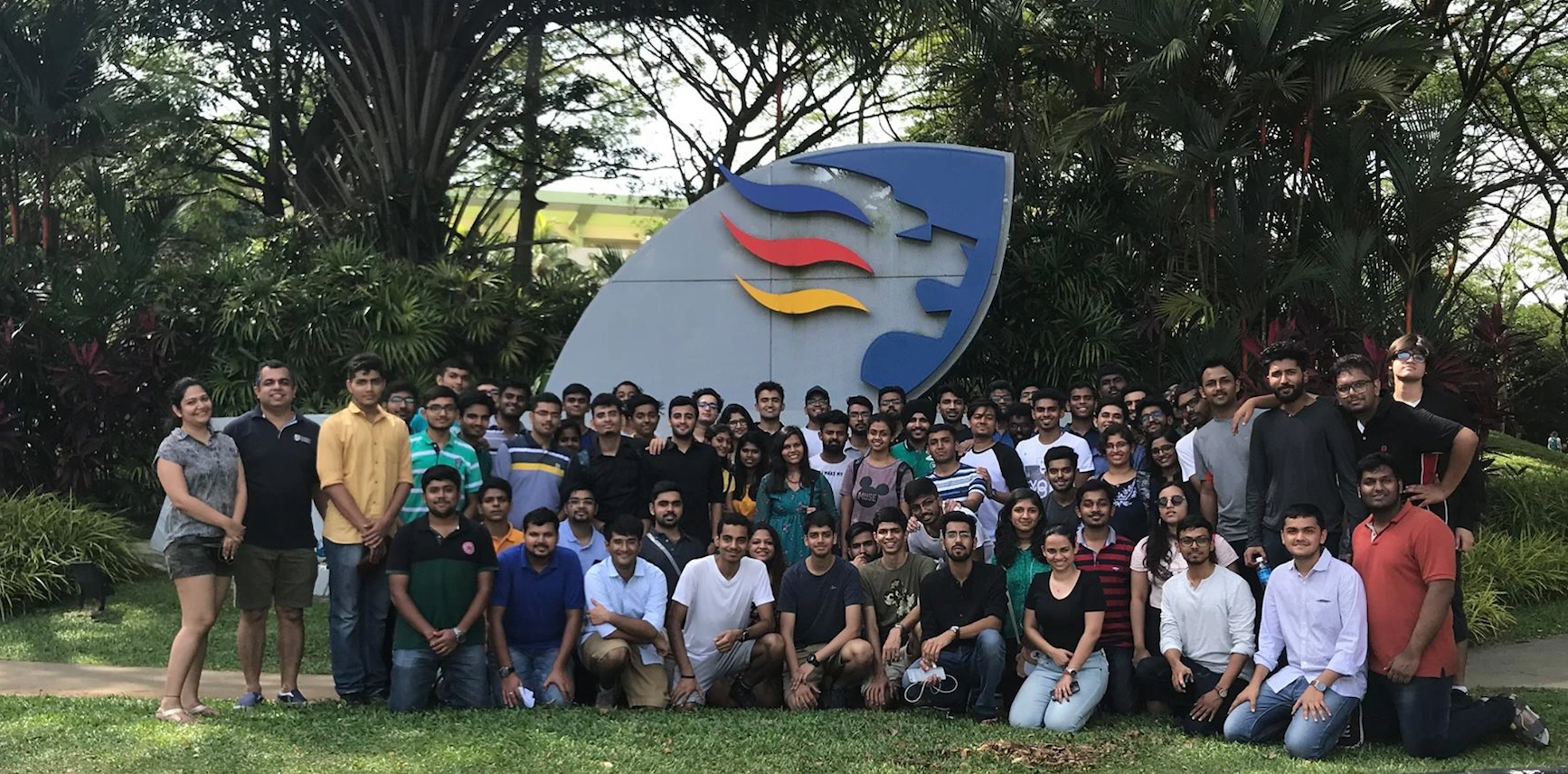
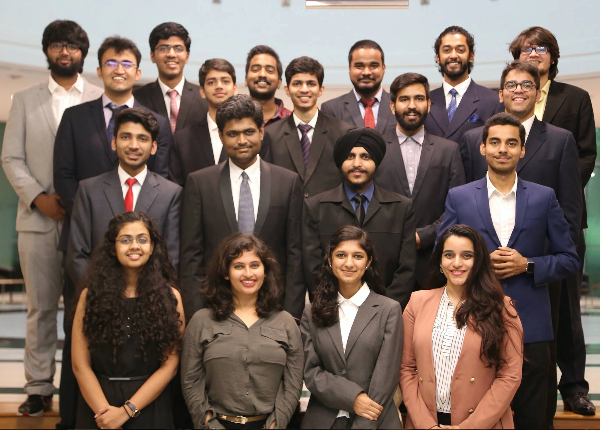
Immersion Participants on a Campus Orientation at NUS
Corporate Gurukul in the Media
Recognized globally for transforming education and bridging the gap between academia and industry
Experiential Learning Innovator
Recognised as Experiential Learning Innovator by EducationWorld
170,000+ Alumni
Empowered participants from 150+ universities and 100+ schools across 27+ countries since 2007
Industry Leader
Featured in leading publications for innovation in experiential learning
Featured Press Coverage
Want to know more about our impact?
Explore Our Partnerships